Book Review | My Kennedy Years by Jacques Lowe

TEXT AND PICTURES BY DEREK CLARK

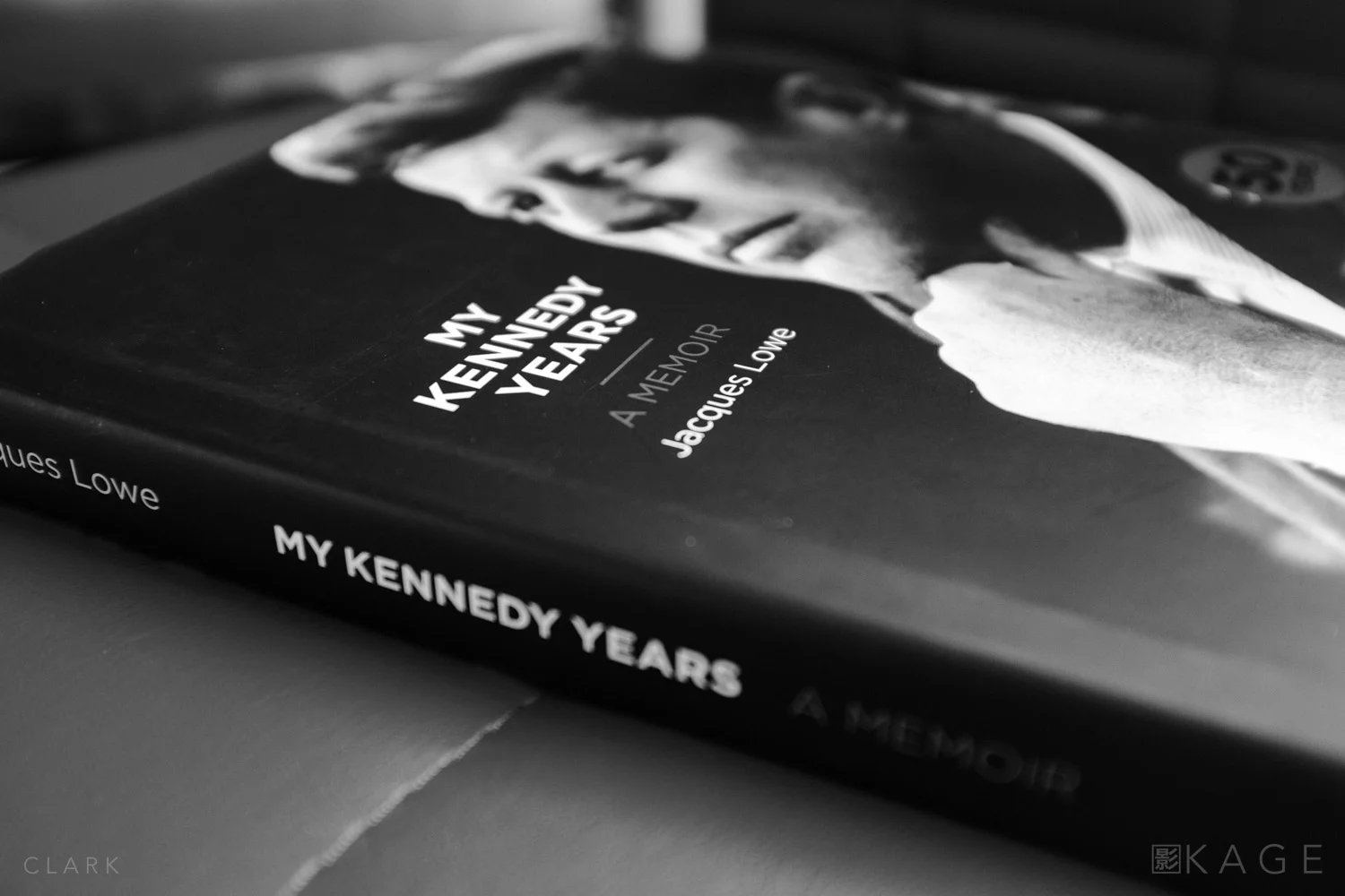
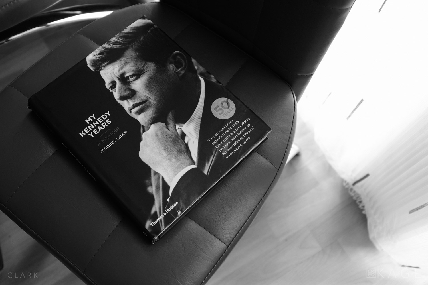
As we've just hit the JFK Centennial, I thought it would be a good time to do a book review of My Kennedy Years by photographer Jacques Lowe. Lowe was JFK's official photographer for five years after they met in 1958. He covered the campaign for the presidency and was Kennedy's personal photographer after he became president. Many of the pictures in this book are of the Kennedy family, real intimate pictures that show the amount of trust JFK had in Lowe. 

THE BOOK
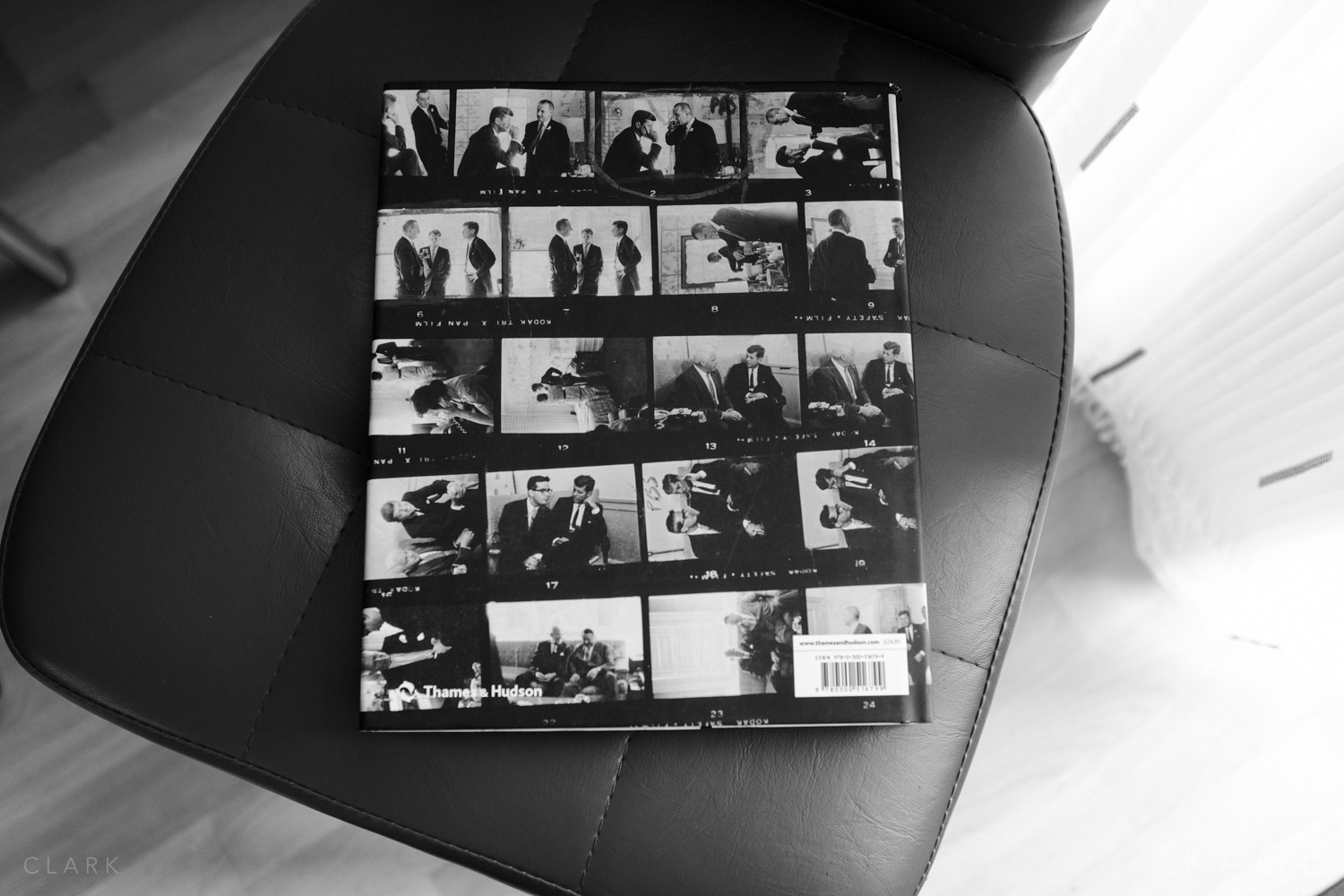
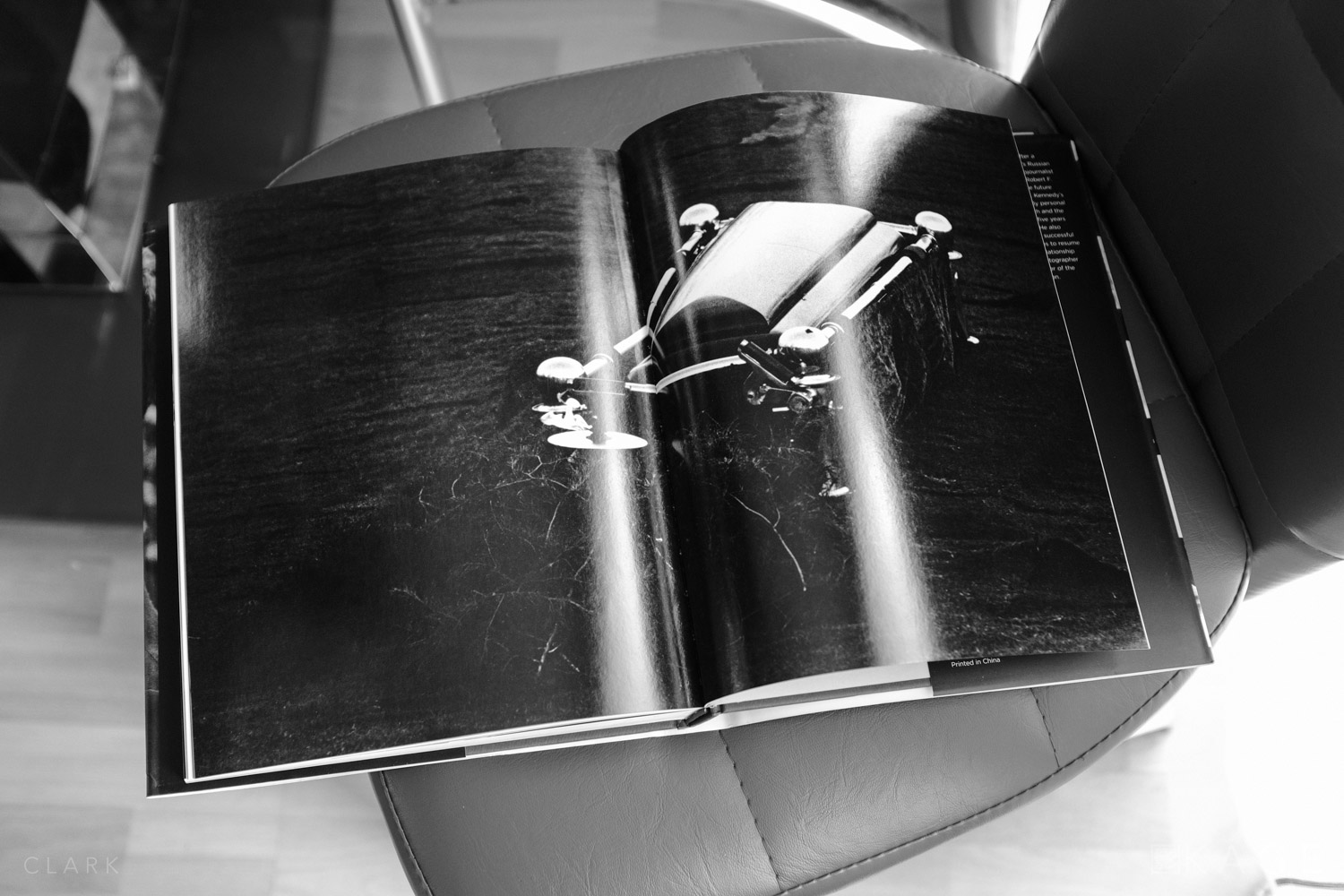
The book comes in at just over 250 pages and has a royal blue cover with the publishers logo embossed on it. The spine has the authors name and the title embossed in silver. There is a black and white outer dust jacket with only the books subtitle 'A Memoir' printed in red, and on the rear of the dust jacket a selection of contact sheets. This is a book of black and white photographs, with the only colour inside the book being the wax pencil markings on the contact sheets (more on these later). Print quality is very high and the pictures are contrasty and dramatic. If, like me, you're a fan of film grain, you will not be disappointed here.

INTIMATE MOMENTS
The sort of access Lowe had with Kennedy is a documentary photographers dream! He would often be the only other person in the room with Jack and Bobby Kennedy, both of whom were assassinated. One such time was a conversation between the two Kennedy brothers about LBJ becoming vice president, which Bobby was against.  Then later it was just LBJ and JFK in the room.

“When it was all finally worked out and time to seal the deal, there were just the three of us in the room - LBJ, JFK and me. Johnson poured himself a healthy drink. Then Bobby came into the room and stood silently by, regarding Johnson with a look of deep suspicion.”

The book is filled with lots of these amazing moments in time - JFK with his brother, his wife and kids, with staff or even moments alone. One such moments was in 1961 when JFK was was being given the news on the telephone about the assassination of deposed Prime Minister of the Republic of the Congo. JFK is clearly shocked, eyes closed and his hand clasped against his face. This is one of Lowe's favourite shots of JFK and he actually got the president to sign a print of it.

CONTACT SHEETS
My Kennedy Years is a book that should interest historians and photographers alike. There are many famous pictures that we know and love here, but quite often it shows a sequence, which reveals a bit more about the scene. There are also a great number of pages devoted to Lowe's contact sheets showing the photographers thought process as he marks and circles the best shots using red, yellow or blue wax pencil. The contact sheets are in both 35mm and medium format and show that Lowe wasn't just allowed in for a quick photo, he was there for the duration and shot some of the best candid photographs in the history of the US presidency. 

FIVE WORLD TRADE CENTRE
In 1999 Jacques Lowe put his archive of 40,000 Kennedy negatives in a safe-deposit box in a vault in Five World Trade Centre. They were destroyed in the 9/11 attacks on the Twin Towers, but fortunately contact sheets and several prints survive. Surely a photographers worst nightmare.

THE END
Lowe decided to go back to New York to re-establish his studio. On November 22nd 1963, he had just finished a commercial shoot in Central Park and was walking back to his studio to shoot a quartet of jazz musicians. He noticed that all the cars had stopped on 6th Avenue and asked one of the drivers what was going on. 

“The president has been shot.”
It didn’t register at first “Which President?”
“President Kennedy.”

Lowe returned to Washington that night. He walked part of the funeral presession with Jackie Kennedy and took his final JFK picture. Jacques Lowe died in 2001. My Kennedy Years was published in 2013 to mark the 50th anniversary of the assassination of JFK. 

Book Review | Afghanistan 2012 by Giles Duley

Text And Pictures by Derek Clark

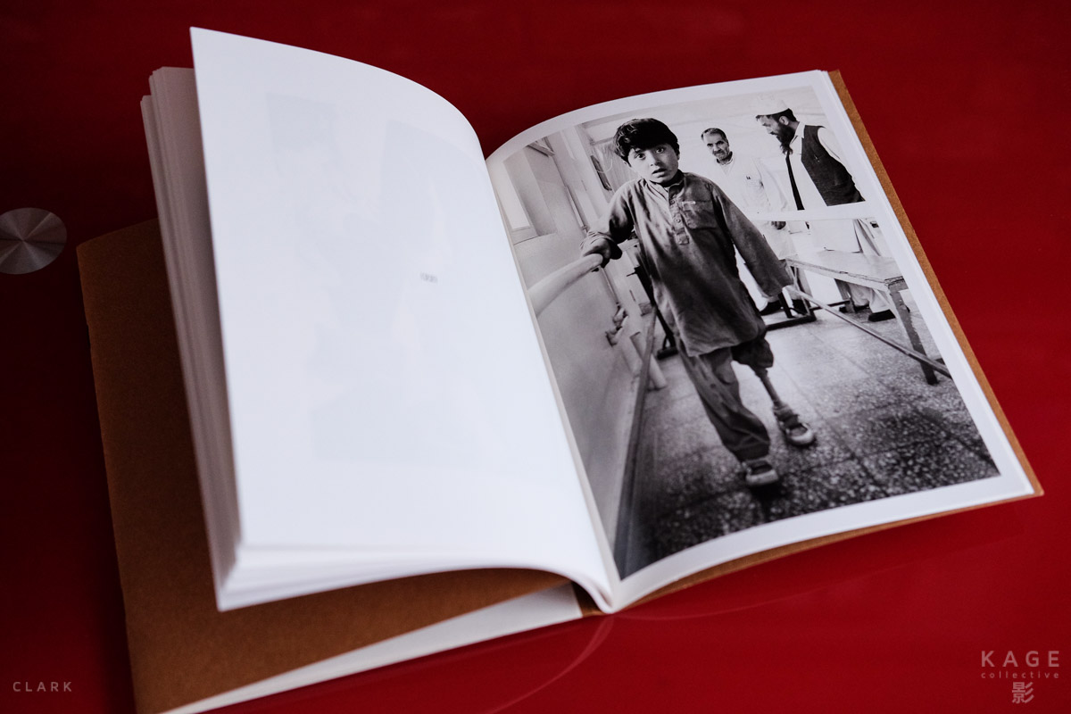
On a cold morning in Feb 2011 Giles Duley was a documentary photographer covering the conflict in Afghanistan. While embedded with the American 101st Airborne, he stepped on an IED (Improvised Explosive Device) and is now a triple amputee. Remarkably, Giles went back to Afghanistan in 2012 to face his demons and keep a promise he made to an Italian surgeon. This book tells the story of his return and is split into two halves, Words and Images.

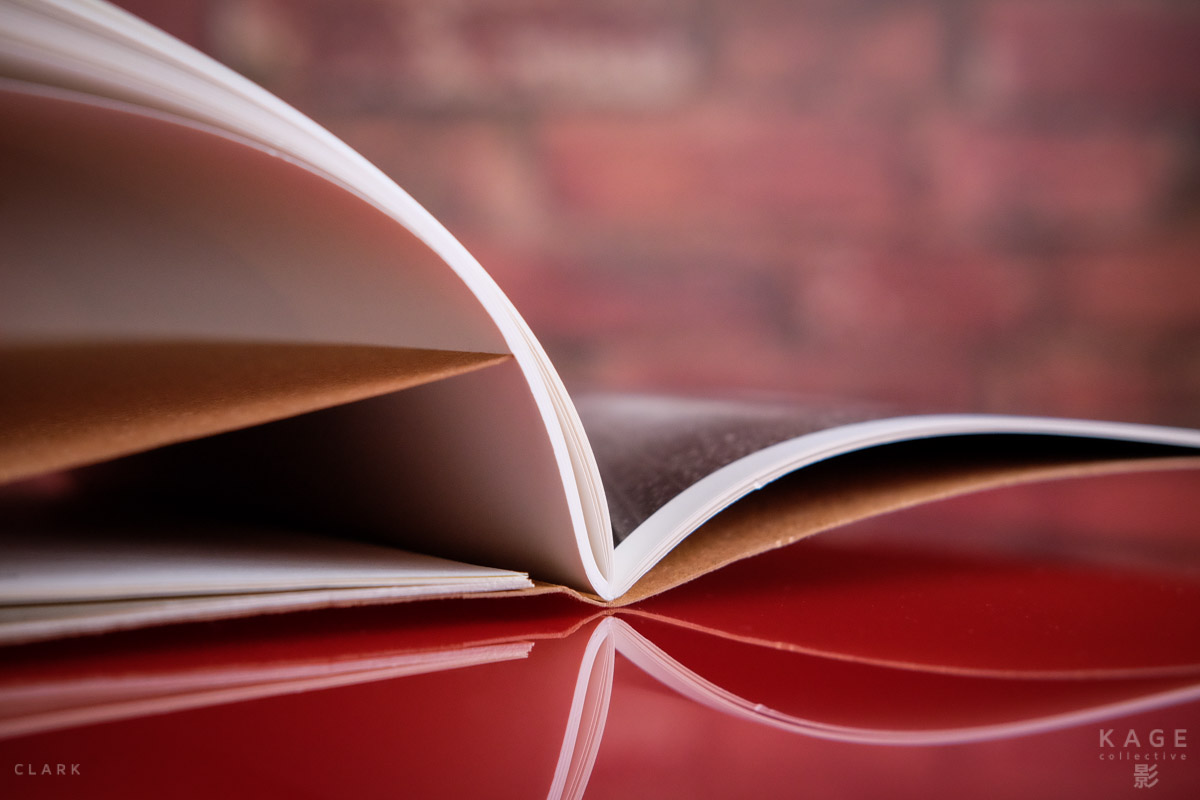
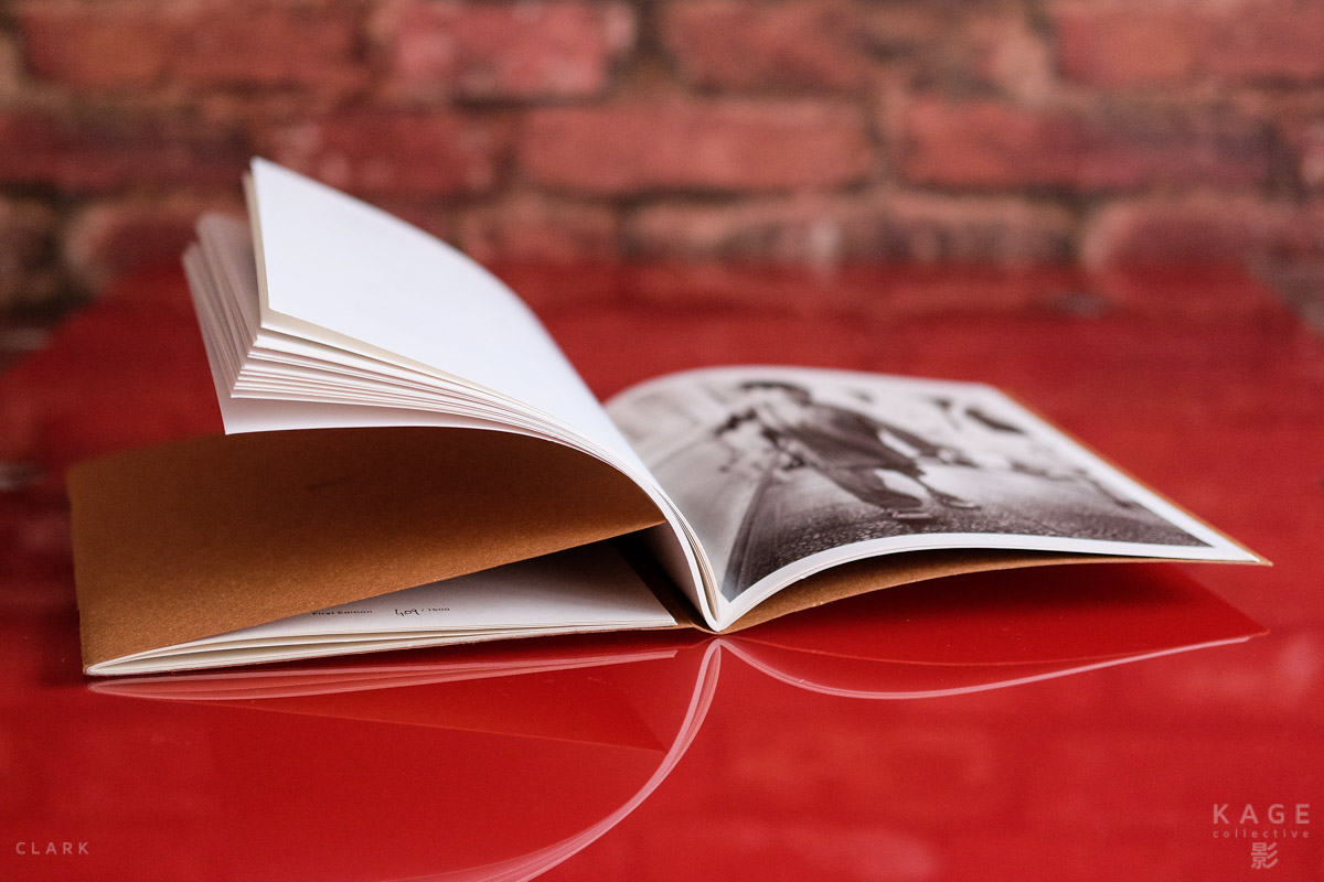
Shar Madani has done a fantastic job in coming up with an original design for this book. The tan soft cover reminded me of an old school jotter. This is not an expensive production by any means and the book is actually held together by three staples down the main spine (on the images side) and two staples down the other spine (on the words side). This is not a negative though as the hand-made craft design gives the impression that you have something really special and unique in your hand. It's hard to describe the design in words, but the pictures included with this review will do the job for me. Basically you open the book to the right as you would any other and then open the words section to the left.

The Words section tells the story of Giles brave return to Afghanistan after stepping on an IED and losing multiple limbs. Giles was ironically due to start a project to document a hospital funded by the charity Emergency, a promise he made to Italian surgeon Gino Strada and a promise he kept by returning in 2012. The courage Giles faced by returning to the place that changed his life in such a dramatic way is absolutely astonishing.

The Images section of the book feature a selection of black and white and colour photographs of victims of war, especially IED's. Each picture is printed alone on the right hand page, while the corresponding number is printed on the left hand page. This is just as well as the paper is not the thickest stock, but the quality of the printing is still high. His pictures are from an Afghan hospital and some people might find them a little too graphic. One such picture shows a hand being held over a trash can to catch the blood. Only three fingers remain intact in what is clearly a fresh blast wound and all the more powerful being a colour shot.

These pictures would have been difficult for any photographer to capture, but to think that Giles was himself a victim of an IED just the year before, doesn't bear thinking of. Giles had nothing to prove to anybody by going back to Afghanistan, but obviously he had something to prove to himself. The courage to make this journey back to the place where he lost both legs and his left arm is almost beyond imagination.

Giles was kind enough to sign the book for me and also included a signed postcard too. A really nice personal touch and something else that make this book just that little bit more special. my copy is a first edition number 409 of 1500. I'm not sure if there was a second edition produced or if the book is still available, but if you are interested in purchasing Afghanistan 2012 you should contact Giles through his website at www.gilesduley.com

Book Review: Handboek - Ans Westra Photographs

Book Review: Handboek - Ans Westra Photographs

In 2005, as part of a major career retrospective and touring exhibition, Ans Westra's Handboek was published - a collection of essays, interviews and images from her career spanning the late 1950s through to just months before the book was released. Curator (and long time friend of Westra's) Luit Beirenga gathered a group of New Zealand's best and brightest commentators to contribute to this, and the essays are both thoughtful and direct - much like Ans' own work.

If you haven't been to New Zealand, and lived there for several years, you most likely won't know the name, or the work. She moved from the Netherlands in the late 1950s, and began working with academic publishers on school books for Kiwi children, recording life as it was lived at the time.

First Impressions of the Fujifilm X70

Text and photography by Bert Stephani

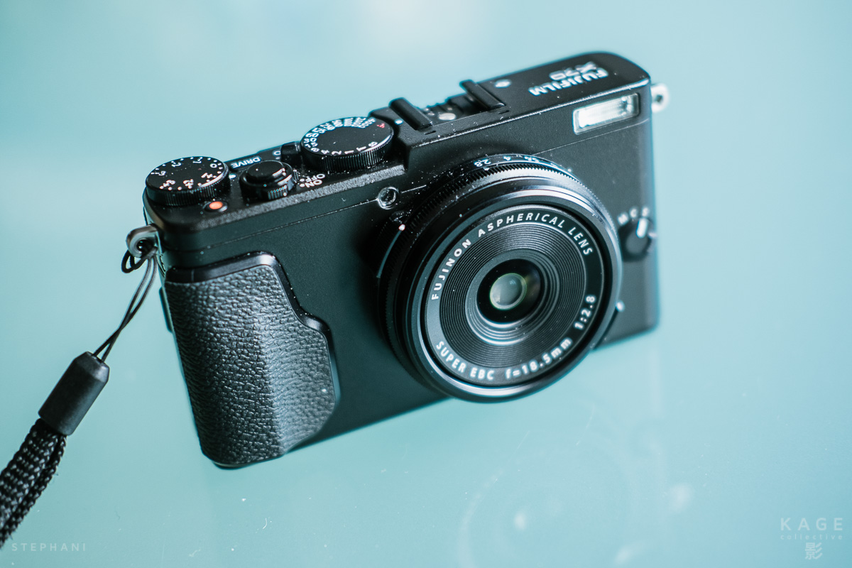
It was over two years ago, when some people at Fujifilm Japan told me about the idea to make a camera that would essentially be the smaller brother of the X100-series. I must admit that I wasn’t really sold on the idea of such a camera at first. It was only a couple of weeks ago, when I got a little play with a prototype X70 in Japan, that it started to make sense. For the last few days I have been playing with a production version and I will do a complete review after my upcoming trip to Cuba. For now, I just want to give you my first impressions. 

The very first thing that came to my mind when I held the X70 in my hand was: “this camera will fit in my jeans pocket” and that’s exactly the reason why I immediately pre-ordered one. Until now the X100T and the X30 were my always-with-me-cameras. The X100T was just a touch too big for the job and the X30 didn’t have the excellent large X-Trans sensor. The X70 is not that much smaller than the X100T but unless you like skinny jeans, it fits in a decent size trousers pocket and it has the big sensor. 

The X70 definitely shares its DNA with the X100T. As far as I know it has the same sensor and feature set as it’s big brother but it’s considerably smaller and a lot cheaper. This of course means that some compromises had to be made: the X70 has no viewfinder, the build quality is not as refined as on the premium X100T and the lens is a stop slower at f/2.8 (and a bit wider with it’s 28mm equivalent focal length). To me, none of these are true deal breakers, especially for a compact always-with-me-camera. Just know that it’s not an X100T. 

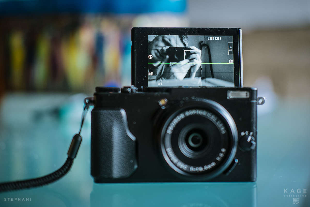
The articulating screen is a great feature of the X70. It’s ideal for shooting inconspicuously from all kinds of creative angles. It’s also the first X-camera with a touch screen. You can focus, shoot or both with a tap on the screen or you can just turn off the touch function altogether. In playback mode you can swipe through images and pinch to zoom. Currently that’s all you can do with the touch screen but I imagine more touch features could be added through firmware updates. 

The screen flips up completely for selfies with your ladybug daughter

The screen flips up completely for selfies with your ladybug daughter

The X70 has all the manual and advanced functions of a real photographer's camera but there’s also an auto-switch on the top-plate that turns the camera into a foolproof snapshot machine. Not a function that serious photographers will use a lot maybe, but now at least you can hand the camera over to non-photographer friends and family members. Now my eight year old daughter can take artsy pictures of earthworms.

So far, I’ve been having a lot of fun with the X70. I’ll be giving it a proper workout in Cuba in a couple of days and I’ll report back after the trip. In the gallery bellow you’ll find some random shots with the X70.

Book Review | Magnum Contact Sheets

Review and photography by Derek Clark

I have a bit of an addiction to photography books. They take very little effort to read and the amount of knowledge you can get from them is absolutely vital if you want to grow as a photographer. The biggest problem with photography books though, is not to allow them to sit on a shelf and gather dust after you first consume them. In fact you will probably gain more from them the second, third, forth, fifth time...etc. You see, these books are not DVD movies that get watched once and then sit there with no purpose other than to take up space. They are our largest source of learning and a very underestimated part in our growth. 

I have a lot of photography books, but one of the most valuable for any photographer, especially documentary photographers, is Magnum Contact Sheets. I almost feel like apologizing that this first Kage book review might be a little obvious, but I doubt if there is a better, more encyclopedic book out there that allows us inside the minds of so many great documentary photographers than Magnum Contact Sheets.

The original version of this book was an oversized and costly affair that came in with a £90 price tag here in the UK. That might be a little expensive for a book, but it was still worth it in my opinion. But the reason I never bought that version was that each time I saw it at Waterstones (bookshop), the book was always damaged in some way. Probably because it was so large and awkward too handle. But hoorah, a smaller version became available and at half the price. It's this version that you see in the photos here.

So what is Magnum Contact Sheets? Basically it's all the stuff you wouldn't normally get to see from the top Magnum photographers. The shots they take before and after that single frame that the world knows and loves. You know, the reason you think their pictures are so great and yours are as much use as an arse full of boiled snow. It shows that The Decisive Moment (as coined by Henri Cartier Bresson, who is also included in this book), while valid and at times crucial, can be a bit misleading and not really that helpful to aspiring photographers. As you will see inside the book, Bresson did not wait for that one decisive moment to present itself to his 50mm Leica lens before pressing the shutter, but worked the scene and took many shots before capturing one that he felt was good enough to present to the world. He would then continue to shoot more pictures, possibly only knowing which one was the decisive moment after looking at the contact sheet?

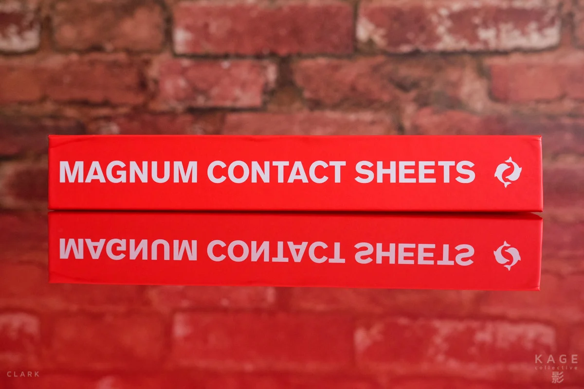
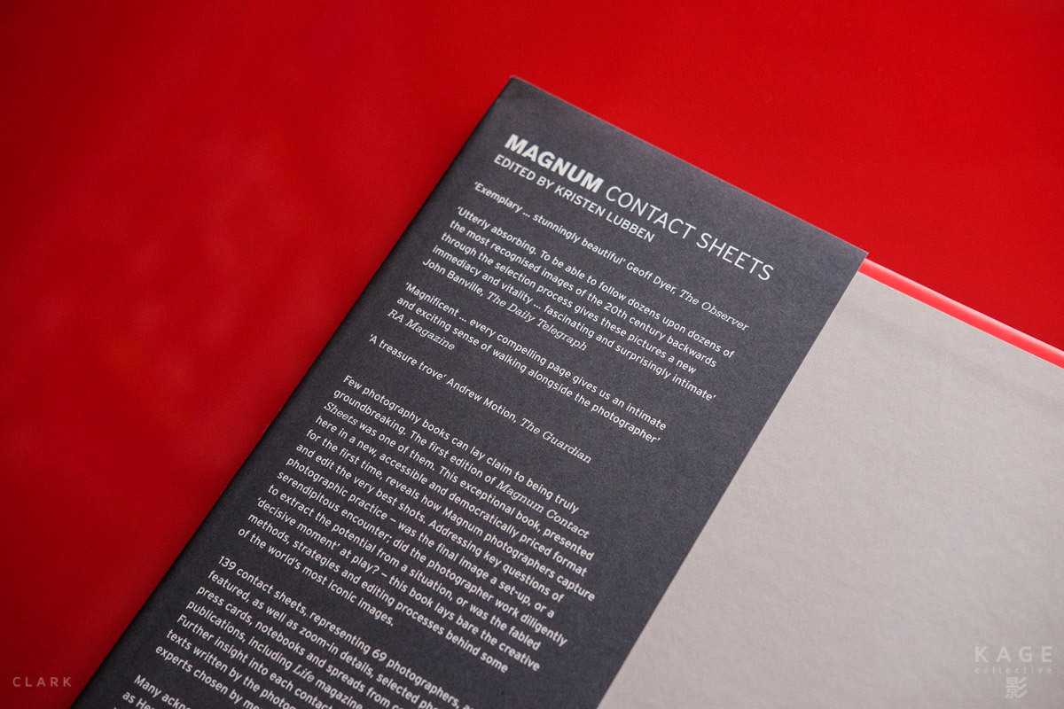
The book is 30cm tall x 25cm wide x 5cm thick. It has 525 pages and according to the dust jacket there are 446 illustrations, of which 240 are in colour. The dust jacket is a plain grey paper affair that is a bit flimsy and the only part of the book that doesn't live up to expectation. It looks fine, but the paper is a bit too thin and easily ripped or creased, which is usually why you will find this book damaged in bookstores. It's also the reason I bought it from Amazon and had it gift wrapped. Not because I'm a sad case that sends presents to myself, but to make sure the dust jacket would not be damaged in transit. But don't be put off by this minor detail, because every other aspect of the book is excellent. Remove the dust jacket and you have a rather surprising bright red hard cover with wax pencil design to match the contact sheet theme.

Magnum have a history in great print quality across their books and Contact Sheets is no exception. The black and white pictures have rich contrast with deep blacks and bright whites. The pages have more of a sheen than a gloss finish and that's fine by me. The only other Magnum book I can think of having better print quality would be Magnum Revolution, which is outstanding and also highly recommended.

So which photographers would you expect to find inside? Well there's Henri Cartier-Bresson, Robert Capa, Elliott Erwitt, Cornell Capa, Eve Arnold, Bruce Davidson, Philip Jones Griffiths, Josef Koudelka, Alex Web, Abbas, Larry Towell, Trent Parke and a lot lot more too. There are serious subject matters from 911 to Vietnam, Martin Luther King to JFK. There's also some of the more humorous pictures here too, including Elliott Erwitt's  Bulldogs 

The text that accompanies the contact sheets is equally fascinating and is written by the photographers. Josef Koudelka tells how his girlfriend called him on the 21st of August 1968 to say that the Russian troops were entering Prague. He took his two cameras, one with a 25mm lens and the other with a 35mm, both of which were loaded with motion picture film because it was cheaper, but that meant that the contact sheets had to be numbered by hand after printing. Five photos from that one contact sheet were used for Koudelka's book Invasion Prague 68. Some were also featured in a more recent book called Nationality Unknown, a book that I own and also highly recommend.

Thomas Hoepker talking about his iconic picture of Muhammad Ali's fist close to the camera with his face thrown out of focus, says "At the time we had a simple rule: if you meet an interesting person, just stay with him/her... until he/she throws you out. He goes on to tell how Ali walked over to him standing in the shadow. Ali throws a left, right, left punch into his wide angle lens. Hoepker thinks it's another missed opportunity because of the low light and trying to manually focus on those fast moving fists. But years later that one grainy shot was used by magazines and books, hung huge above museums and sells in countless photo auctions.

The book includes black and white contact sheets, colour and even some with colour slides. We see the markings made on the contact sheets as the photographers choose the frames that work and reject the ones that don't. We of course see the best shot highlighted and even see some of the notes hand written on the back of sheets.

I have many photography books in my collection and I did plan on reviewing something a little more obscure that would make me look all cool, suave and sophisticated (yes I know). But Contact Sheets kept sliding out seductively from the other books and I honestly can't think of another book that is more valuable and rich with content for the aspiring documentary photographer. This book is worth every penny and is definitely the gift that keeps on giving. Revisiting the book for this review has made me want to go back to the very beginning and slowly work my way through it once again. I hope this review has been helpful to you and if you don't already own this book, I think you should direct a few strong hints toward your significant other. The chances are, like me, you have enough gear and more gear probably won't improve your photography. But books will.

An X-Pro2 collective review


HELLO LITTLE CAMERA | KEVIN MULLINS


I think it’s fair to say we’ve all be waiting a long time for the Fujifilm X-Pro2. Well, today, it’s here.

Firstly, I think those photographers all over the globe that fell in love with the ergonomics and aesthetic of the X-Pro1 have to congratulate Fujifilm on their unwavering belief in the form, shape and tactility of the camera – for the X-Pro2 is almost identical.  Which is a great thing.

I received a pre-production version of this camera back in November 2015 and all the images in this section are shot on that pre-production camera.  For that reason, don’t expect RAF files for comparison; the images you see here are from the JPEG images the camera has made using the new high performance X Processor in the camera. So, as part of my own little promises to myself, when I’m making notes about a new camera I want to show the very first image I ever took. It’s not exactly interesting, but was taken around 30 minutes after the camera was given to me:

I told you it wasn’t very interesting.  But what, perhaps might be more interesting is the fact that this image is shot at 12,800 ISO. This image is totally untouched and straight from the camera using the B&W+R film simulation

This is possibly a good time to interject with the relevant technical details of the new camera:

  •  Newly developed 24.3MP X-Trans CMOS III sensor.
  • New high-performance X Processor Pro image processing engine.
  • The world’s first Advanced Hybrid Multi Viewfinder offering the benefits of both optical and electronic viewfinders.
  • New focal plane shutter with a top speed of 1/8000 sec. and flash sync up to 1/250 sec.
  • New graphical user interface design.
  • Robust, weather resistant body meets the needs of professional photographers.

And here are a few other details that I have personally found very appealing whilst using the prototype:

  • The direct AF selection joystick.
  •  Even though the new sensor is 24.3 MP, Fuji seem to have worked marvels on the low noise algorithm and it’s good to be able to shoot RAW files at 12,800 ISO now too.
  • I’ve become addicted to the Acros film simulation.
  • Some of you may not immediately find the ISO selection tool on the top dial easy to use – but believe me, give it one shooting session and it becomes natural.
  • I like to shoot in AV mode quite often and I can now use exposure compensation to +-5 ev.
  • The new sensor obviously creates large RAW files.  Luckily, Fujifilm have included a new lossless RAW option which yields RAW files approximately 50% smaller (and I can’t notice any difference in the data or quality of the RAW file).

Here are some images I shot using the camera for the first time at a wedding:

Finally, for those who found the AF speed and Shutter lag of the X-Pro1 an issue: well, this has been addressed in its entirety by Fujifilm.  I was genuinely astounded at the speed of shooting with this camera.


Acros & NEW Expanded Settings | Patrick La Roque


Fujifilm pride themselves on their film heritage, something that's always been evident with the film simulations included in the X-Series cameras. What at first seemed like a gimmic on the original X100 has, in my opinion, proven to be a significant feature. This is where the company's personality shines through—the introduction of Classic Chrome a little over a year ago made this abundantly clear. It may be anathema to anyone who considers raw the only serious image format, but I ditched the raw-only dogma when I switched to Fuji cameras five years ago and never looked back. I've published and printed and delivered JPEG images. Sue me.

I already knew the Acros black and white film simulation would be introduced with the X-Pro2 and was looking forward to seeing the results. What I didn't expect were expanded image controls, allowing us to customize our files even further. Where previous cameras offer a range of plus/minus 2 on all settings, the X-Pro2 now includes varying intensities. Here's a list of possible modifications:

  • Highlight Tone: -2/+4
  • Shadow tone:  -2/+4
  • Color: -4/+4
  • Sharpness: -4/+4
  • NR: -4/+4

Monochromatic

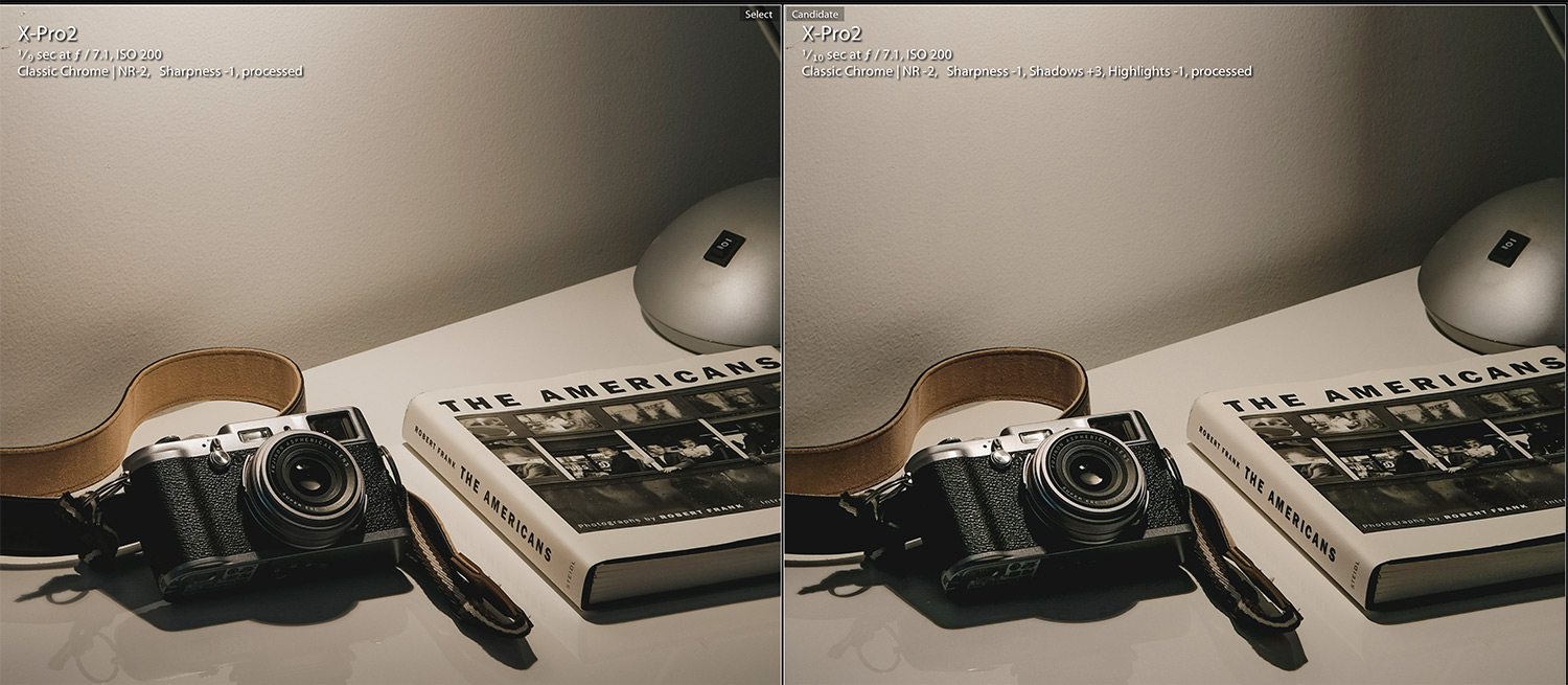
My first reflex was of course to experiment with Acros. According to Fuji, the simulation "produces smooth tones, deep blacks and rich textures that are far superior to conventional monochrome modes". I've always had a custom black and white setting on my X-Series cameras, boosting both highlights and shadows to create more contrast, so I was very curious to see what could be achieved. In a side by side comparison with the older B mode, I first had to admit the differences seemed rather subtle—at least for the subject I was shooting. But once I started combining the new simulation with the expanded custom settings, things got interesting: there seems to be a built-in tone curve in Acros that holds up much better once you start tweaking those in-camera settings. In fact, it feels as though this is what Fuji engineers intended when they created this mode, which makes sense when you think about it; they are being introduced simultaneously after all. 

I've found Acros mode to indeed create a more graduated image when pushed, in both shadows and highlights, while still maintaining contrast. In fact it looks a lot like how I process my images in Lightroom...hmm...there goes that workflow. But that's the entire point here: just like Classic Chrome allows me to create files that are much closer to my intended final results, Acros in turn does this for black and white. Below are  two Acros files straight out of camera followed by a few more images shot using the new simulation over the past few months (all with a pre-production X-Pro2):

Variations

I also wanted to play around with the new range of settings available, if only to see where this could lead. So here's a technical line-up showing off possible contrast variations including colour, black and white and the new grain simulator:

Once processed, different variations will obviously yield different results. Here's an example of two files processed the same way, except for the contrast version being pushed back up in post:

Here's Grain Weak vs Grain Strong on the same high contrast variation:

Left is weak, right is strong.

I'm not entirely sold on the grain engine but I'll be curious to see how it looks in print (which is how Fujifilm expects it to be used according to the release notes). It's a very tight high frequency grain structure.

Overall I can't help but feel the X-Pro2 brings us closer to the SOOC dream—even though I'll always consider processing an integral part of photographic work. It'll be interesting to see if any of these features trickle down to other X bodies through firmware updates — some of these functions may be tied to the new X Processor Pro. But whatever happens: it certainly shows us a glimpse of the future.

Oh and the camera as a whole? Bloody fantastic.
More please.


MUSIC PHOTOGRAPHY | FLEMMING BO JENSEN


I work as a music photographer and I have shot gigs with the Fujifilm X-100 (the original), the X-Pro1, the X-E2 and the X-T1. For the past nearly two years my camera of choice has been the X-T1 and it is an incredible performer at gigs. It is almost the perfect music photography camera, so how would the X-Pro2 fare?

I had the chance to find out just a few days after receiving the X-Pro2, when Zouk Singapore very kindly allowed me to photograph their Halloween party. Later on, in December, Club kyo in Singapore very kindly allowed me to shoot when the legendary Francois K played. What follows are my main impressions.

I LIKE

  • The new 24.3MP X-Trans CMOS III sensor. ISO 12,800 oh yeah! Almost all of my work requires at least ISO 6400 so low noise capability is extremely important to me. The lack of noise at high ISO is spectacular. I thought the X-T1 was fantastic, but this is mad good.
  • The fast shutter. It is practically instant, it has a great feel to it, and sounds nice as well. It is such a pleasure to shoot with and makes it easier to capture fast moving action and lights.
  • The new super fast X-Processor Pro image processor. The camera is just in general fast responding and I especially like how fast the startup time now is. 

I DISLIKE

  • The AF-L “back focus” button. On the prototype, the AF-L button is so recessed that it is unusable (this will apparently however be fixed in the production models). For me, the AF-L button is also in a place that is almost unreachable. Fortunately the AE-L and AF-L buttons can be swapped in firmware, this is better but still not great. It continues to puzzle me that Fujifilm do not seem to understand that a lot of us shoot 99% of the time in manual mode using back button focus.
  • The new ISO wheel. This is the second ISO wheel design on an X-camera, and here we have ISO selection built into the shutter speed wheel. It is different but not better than the ISO wheel on the X-T1, which I am not a big fan of either. Again, this is a button I use all the time and I really dislike using this new wheel while shooting. 
  • No flip screen. The flip screen on the X-T1 is an amazing tool that enables me to easily shoot from high or low positions, and I miss having one on the X-Pro2.
  • Smaller viewfinder. For working in pitch black nightclubs there is just nothing like that X-T1 viewfinder, the sheer size of it is like having night vision goggles. The X-Pro2 viewfinder is a lot smaller and I do really miss the X-T1 viewfinder.

SUMMARY

Shooting music, especially electronic music gigs which tend to be dark as the night, is often pushing the camera to the limits. In this respect, the amazing image quality and low noise of the new X-Trans III sensor is fantastic and much better than the X-T1. The X-Pro2 also responds a lot faster, feeling practically instant. There are however some things where the X-T1 really shines, in particular that amazing huge viewfinder and the flip screen. Overall, the new sensor probably will win out and I will end up using the X-Pro2 for most of my electronic music gigs but I am undecided for now and need to use the X-pro2 at more events.

Read the full review of using the X-Pro2 at music events on my blog.

GALLERY

A small selection of music images made with the pre-production X-Pro2. Thank you Zouk Singapore and Club kyo in Singapore.


THE PORTRAIT PERSPECTIVE | BERT STEPHANI


Even though the X-T1 brought significant technological improvements, the X-Pro1 has always remained my favourite camera for portraiture, mainly because I prefer the rangefinder-style shape over the mini-DSLR form. With the X-Pro2 I get the ergonomics of the X-Pro1 with the functionality of the X-T1 … and more. 

The X-Pro2 feels just fine in my regular sized man hands. After retraining my muscle memory for a couple of days, all the buttons and dials seem to be at the right place. If you are right eyed like me, the viewfinder on the side gives you the benefit of not being hidden behind the camera. With a DSLR-style camera, even a small one like the X-T1, the camera hides most of the photographer’s face. For me it’s very important to build a rapport with my subject. With a camera that isn’t a barrier between us, I find it a lot easier to connect to the sitter. 

For me, the X-Pro2 is made to be used with prime lenses. With bigger, heavier zooms like the 16-55 or the 50-140 the camera is less well balanced than an X-T1 with the battery grip, particularly when shooting vertical. 

The improved AF and the ability to quickly change focus points with the new joystick make life easier. I often shoot with a very shallow depth of field, so the focus must be absolutely spot on. There are also some improvements in the shutter speed department. The mechanical shutter now goes up to 1/8000 and if that’s not fast enough, you can use the electronic shutter for even faster speeds when using a wide open aperture in a bright environment. Finally, we also get the industry standard 1/250 flash sync speed which is good news for anyone who likes to combine ambient light with flash. 

The X-Pro2 has the kind of wifi-connectivity we’ve seen in all the latest cameras and can print straight to the Instax Share SP-1 printer. As I often want to send a quick picture to the subject for social media use or give them one of those little magic Instax prints, this is a great addition to build connections. 

For portraits I often use the Astia and the Black and White with Red Filter film simulations. These are still there and we get more control over the degree of noise reduction, shadows, highlights and sharpening in camera. There’s also the new Acros black and white film simulation which I found to be very pleasing in some portrait situations. Your preferences may vary from mine but more options and more control are better for everyone. 

The X-Pro2 has a new sensor that packs about eight more megapixels but the Fujifilm magic is still presents. I also figure, I can go up one more stop in the ISO settings compared to the X-T1. I’ve been doing a number of test portrait shoots with a prototype of the X-Pro2 and there’s only one thing that I didn’t like … I couldn’t share my enthusiasm because the camera had to remain a secret … until now. So here it goes: Yihaaaaaaa, the X-Pro2 is here and it’s everything I expected and hoped it would be. 

GALLERY


STREET SHOOTER | CHARLENE WINFRED


Picking up the X-Pro 2 for the first time felt like returning to some kind of photographic home. It hits all the right notes with the amazing new X-Trans CMOS III sensor and shutter, which manage to improve on already sensational low light handing and responsiveness. Its shape is still delightfully discreet, with the classic styling that the X-series is known for. 

There are a heap of improvements and new additions:

  • The new 24.3MP X-Trans CMOS III sensor that gives us native ISO 12,800 (the camera can officially see better than my eyes)
  • That fantastic new shutter which is fast - up to 1/8000 sec - and delightfully responsive
  • Dual card slots
  • New Acros film simulation
  • Exposure value compensation of up to +/- 5 with with the new C mode

And a whole bunch more which I won't address here because they are features that I haven't used. There is plenty I love about it, a few things I don't like so much, and other things which just leave me confused.

But all that aside, the thing I really love about the X-Pro 2: It feels right at home in my hands.

When I say "right" I mean "like the X-Pro 1," which was my first X-series camera, and together with the XF 35mm f1.4, the only camera gear I had for 2 years. I'm used to the weightiness of that set up, its dimensions, how it performed, and importantly, how the set up made me perform. The X-Pro 2 takes all of that and improves on it. The same no-frills, black rectangular box styling still calls little attention to itself on the street, while all that great technology under the hood goes to work: faster, less laggy shutter, improved low light and noise handling ability, make changing (read: rapidly fading) light and wet weather (the X-Pro 2 is weather resistant) a little easier to handle.

The X-Pro 2 brought back the pleasure and intuitiveness of a camera that was an old friend. It was good to have the new X-series flagship back in my bag.

A more detailed review can be found here: http://charlenewinfred.com/2016/01/15/xpro2/